Rebranding & web design for De Schoonschrijfster
Client
De Schoonschrijfster
Project type
Rebranding & webdesign
Date
September 2025
A year ago, I got in touch with Sylvia, also known as De Schoonschrijfster. She was looking to have her website redesigned. After our initial meeting, however, she decided to put the project on hold for a while. Then, about a year later — just a few months ago — I received another email from Sylvia. This time, she was ready to move forward with her website.
After some back-and-forth, we realised that a rebrand would also be a valuable step. And so, this incredibly enjoyable project — combining both rebranding and web design for De Schoonschrijfster — was born.
Sylvia’s business is thriving, so it was important that her new brand remained recognisable to her existing clients. At the same time, there was a clear opportunity to elevate the brand into something more refined and high-end. Sylvia works with renowned luxury brands such as Dior and Chanel, and she wanted her own brand to reflect that same level of sophistication.
I created a brand identity that blends elegance, luxury and refinement with Sylvia’s deep passion for her craft. The personal touch woven throughout the design not only reflects Sylvia’s personality, but also subtly references the art of calligraphy itself.
The result is a cohesive brand identity and a new website that positions Sylvia as a leading calligraphy expert in the Netherlands — and beyond.
The creator
The 'creator' archetype holds expression and refinement in high regard. The strength of this archetype lies in craftsmanship, creation, aesthetics, and originality. Creator brands are authentic and challenge their target audience to be creative.
In addition to the creator, Sylvia also matches the 'lover' archetype. Lover brands are passionate, and their target audience values aesthetics and luxury. The lover archetype connects with people and finds it important to offer an experience that appeals to all the senses.


Titles & headers
Sloop Script Pro
Headers
Kepler STD Regular
ABCDEFGHIJKLMNOPQRSTUVWXYZ
abcdefghijklmnopqrstuvwxyz
Body text
Avenir Light
ABCDEFGHIJKLMNOPQRSTUVWXYZ
abcdefghijklmnopqrstuvwxyz
Font variation
Awesome Ways
ABCDEFGHIJKLMNOPQRSTUVWXYZ
abcdefghijklmnopqrstuvwxyz


The result
At the end of the process, Sylvia doesn't just have a brand identity and website. She has a visual identity that is strategically aligned with her ideal client segment: luxury and high-end brands.
The new branding not only communicates quality but tells a story that resonates with clients who appreciate refinement and craftsmanship. Through the choices of colour, typography, and visual elements, the look feels professional, streamlined, and coherent: a reflection of who Sylvia is and who her clients want to be.
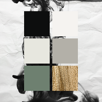
The colour palette exudes tranquility, elegance, and subtlety. Tranquility creates trust and reflects the precision and attention to detail that are central to Sylvia's calligraphy. At the same time, the selected typefaces enhance the luxurious yet personal experience: refined, personal, and accessible.
The branding elements, such as the golden icons and textures in the backgrounds, are inspired by her craft. Paper forms the calm base, while ink and calligraphy are the showstoppers. This creates a visual metaphor for Sylvia's work: simplicity as the foundation, finesse as the expression.
The new website fully supports this identity. Through subtle typography, white space, and a clear structure, the visitor immediately experiences: here works a professional with precision, a love for detail, and a touch of luxury; exactly what high-end clients look for in a calligrapher.
Sylvia's thoughts on the collaboration

"Working with Romana was a true pleasure. She listened attentively and transformed De Schoonschrijfster’s vision into a rebranding and website that exudes sophistication and allure – perfectly fitting the luxury brands I work with.
The result feels timeless, elegant, and unmistakably like myself. It was a great collaboration."