Rebranding & web design for Development by Do
Client
Development by Do
Project type
Rebranding & webdesign
Date
August 2025
Dorine from Development by Do initially came to me to design a few handouts for her clients.
We started talking because she actually wanted a website too. She had never really needed a website, but on second thought, she found it quite handy to have an online business card. And her branding? It could be more outspoken, and more like her.
Naturally, we started at the core of Dorine's business. Why does she do what she does, and for who does she do it? What makes Dorine's approach so special, and what is it like to work with her? The answers to these questions formed the basis of the brand personality, and from this emerged a strong, distinctive concept.
I ultimately translated this concept into a complete brand identity and a one-page website, so that Dorine can finally claim her spot on the online stage.
The sage
The 'sage' archetype wants to acquire knowledge and teach others what he or she knows. The sage comes across to the target audience as thoughtful and developed. The sage is authoritative, well-substantiated, and factual.
Development by Do also has 'the ruler' as an archetype. The ruler is an archetype that maps out a path for others. The ruler takes control and creates order.


Titles & headers
Radon Regular
ABCDEFGHIJKLMNOPQRSTUVWXYZ
abcdefghijklmnopqrstuvwxyz
Headers
Stage Grotesque Medium
ABCDEFGHIJKLMNOPQRSTUVWXYZ
abcdefghijklmnopqrstuvwxyz
Body text
Bricolage Grotesque
ABCDEFGHIJKLMNOPQRSTUVWXYZ
abcdefghijklmnopqrstuvwxyz
Font variation
With Hearty Alt
ABCDEFGHIJKLMNOPQRSTUVWXYZ
abcdefghijklmnopqrstuvwxyz

The result
For Dorine's branding, I translated her personality into a visual identity that is both powerful and accessible. The inspiration came from the contrast between stone (hard, sharp, steadfast) and water (transparent, flowing, soft). This contrast perfectly reflects who Dorine is: warm and friendly in her approach, but always clear and sharp when necessary.
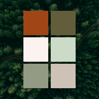
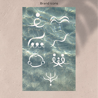
The colour palette exudes calm, warmth, and trust, essential values for her role as a coach. At the same time, the typography adds a subtle, feminine touch, while the hand-drawn brand icons add personality and accessibility. As a result, the branding feels professional, yet simultaneously inviting and human.
For the brand patterns, I drew inspiration from topographical lines used to indicate hilly and mountainous areas. They reference nature and visually convey a sense of movement and flow, just like the process Dorine offers her clients: guidance on their own path, with space to grow and flow.
The logo of Development by Do is composed of the two D's, separated by flowing lines. These symbolize growth, direction, and walking your own path. The brand communicates subtlety and strength simultaneously, creating a recognisable, meaningful signature that visually supports its services.
Everything comes together on a one-page website that radiates calm, trust, and lightness. Every choice, from colour to form and typography, is aligned with Dorine's vision and her ideal client. The result is a professional and inviting brand that authentically positions her in the coaching industry.
Website coming soon!