Rebranding for Een Brede Blik
Client
Een Brede Blik
Project type
Rebranding
Date
November 2024
Een Brede Blik has an important mission: to make the leisure sector in Rotterdam more accessible to young people in Rotterdam with an invisible disability. I had the opportunity to handle a rebranding for this fantastic mission. The foundation of Een Brede Blik's branding was in place, but it was still a bit messy and could simply be sleeker, trendier, and more fitting for the target audience.
It was my first project where I didn't have to deal with a single entrepreneur, but with an entire team. It was very educational to handle the feedback and input from various team members, and to merge this into one fitting concept and ultimate brand identity.
The everyday (wo)man
The everyday (wo)man, also known as the friend to all, is helpful, friendly, and approachable. For this archetype, everyone is equal, and quality takes precedence over quantity. The 'magician' archetype also fits well with Een Brede Blik and stands for believing in yourself; is charismatic and sees everyone's potential. Together, these archetypes are the essence of Een Brede Blik.


Titles & headers
Market Pro Bold
ABCDEFGHIJKLMNOPQRSTUVWXYZ
abcdefghijklmnopqrstuvwxyz
Heads
Avenir
ABCDEFGHIJKLMNOPQRSTUVWXYZ
abcdefghijklmnopqrstuvwxyz
Body text
Avenir Light
ABCDEFGHIJKLMNOPQRSTUVWXYZ
abcdefghijklmnopqrstuvwxyz


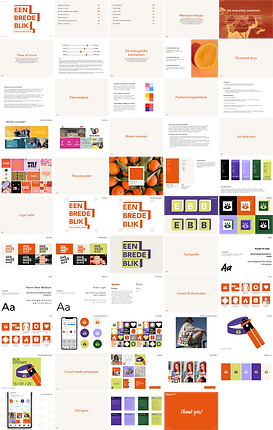
The result
The branding of Een Brede Blik stands out — in a way that is meaningful.
Bold colours, powerful typography, and recognizable icons combine to form a solid visual foundation for a mission that must be seen.
The concept is inspired by Rotterdam, the city where Een Brede Blik is based, as well as the idea of perspective. Therefore, I worked with 3D elements and square shapes: they refer to the city's rectangular skyline and symbolize the new perspectives the organization offers its target groups.
The colour palette is striking, yet at the same time warm and accessible. Every choice has been made with an eye for accessibility, readability, and contrast, ensuring the branding is not only visually powerful but also inclusive and inviting. This makes everyone in the target audience feel heard and seen. And that is exactly what Een Brede Blik stands for.
The new brand identity communicates energy, trust, and direction, and supports the organization's mission on both a visual and conceptual level. Every shape, color, and icon is well thought out and contributes to a brand experience that is both impactful and consistent.