Branding & web design for WeTreat
Client
WeTreat
Project type
Branding & webdesign
Date
February 2026
In September, I got in touch with Madelon & Anne-Fleur, two super enthusiastic and ambitious women from Amsterdam with a great love for Spain. Specifically, a place called Rosamar, where they both own a beautiful villa. They were very keen to start offering retreats and workations in beautiful Rosamar and were looking for a brand designer to give shape to their brand, WeTreat.
The previous 'designer' they had hired for the assignment had created their logo using AI (yes, really!), so my task was not only to design a beautiful, fitting brand identity, but also to restore their trust in a good designer. And fortunately, I succeeded! After the branding process was completed, they even asked me to design their website as well.
And this is now live, together with the sunny and cheerful brand identity.
The caregiver
For the 'caregiver' archetype, caring for others and creating a safe, warm environment are important. Typical characteristics of this brand archetype are: warm, empathetic, and considerate. The caregiver thinks ahead and prevents problems. If balance is lacking, the pitfall can arise where the archetype comes across as patronizing or overprotective. In addition to the creator, WeTreat also matches with the 'discoverer' archetype. Explorer brands value freedom, adventure, and personal growth through new experiences. WeTreat also shares some common ground with 'the Jester'. The Jester seeks fun and wants to make life more cheerful. He uses humor to view the world from a different perspective, to lighten life, with a wink.


Titles & headers
Plantago Condensed Bold
ABCDEFGHIJKLMNOPQRSTUVWXYZ
abcdefghijklmnopqrstuvwxyz
Heads
Costa Brisa Script
ABCDEFGHIJKLMNOPQRSTUVWXYZ
abcdefghijklmnopqrstuvwxyz
Body text
Open Sans
ABCDEFGHIJKLMNOPQRSTUVWXYZ
abcdefghijklmnopqrstuvwxyz


The result
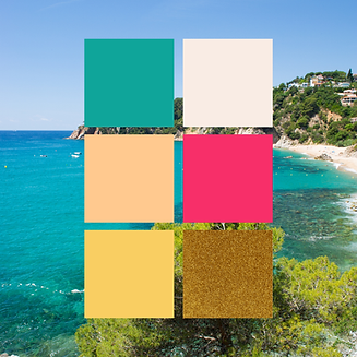
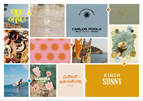
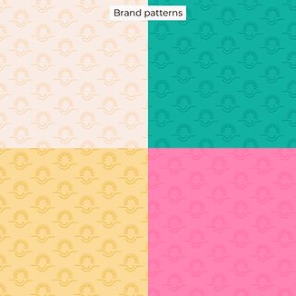
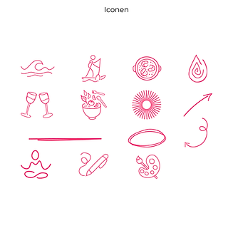
At the end of the process, the girls from WeTreat don't just have a brand identity and website. They have a visual identity that is strategically aligned with their ideal target audience and perfectly reflects who they are. Their love for Spain and the Costa Brava is captured in summery colors, playful fonts and icons, and striking photography.
The new branding communicates not only passion and fun, but above all, an experience. Through deliberate choices in colour, typography, and imagery, the brand feels warm, energetic, and cheerful. It tells a story of relaxation, growth, and coming together—exactly what you are looking for when you want to step out of the daily routine for a moment.
The colour palette is inspired by the Spanish sun and combines warmth with softness. The typography is both professional and personal, making the look high-quality and inviting.
The one-page website fully supports this identity. At a glance, it becomes clear who WeTreat is for and what they organize, both in content and feel. The structure is clear, the composition airy, and the message powerful.
And let's be honest: doesn't this branding instantly make you long for the Spanish sun?
Madelon & Anne-Fleur's thoughts on the collaboration

"Working with Romana felt right from the start! From the first contact, she flawlessly understood who we are and what WeTreat should project. She is incredibly strong technically and knows how to effortlessly translate feeling, atmosphere, and brand identity into a visual style that is perfect down to the last detail.
Romana actively thinks along with us, asks insightful questions, and brings clarity and calm to the process. She connects disparate ideas into a cohesive whole and remains continuously involved. It doesn't feel like handing something over, but rather like building WeTreat together.
The collaboration is open, creative, and relaxed, and we still work together with great pleasure. We are incredibly happy with her and look forward to our future collaboration with great enthusiasm and pleasure!"